The homepage of Jamie Lee Searle’s website, viewed on a desktop screen. The background is a sandy parchment colour and a menu bar at the top right of the screen contains the words ‘About’, ‘Translation’, ‘Editing’, ‘Writing’ and ‘Mentoring’. To the menu’s left is the site’s title alongside a linear pendulum / lightbulb motif in pastel red. Below is a series of graphical book outlines, each with a block coloured panel behind it with rounded inset borders, offset at an angle to the book. The first book contains a globe above a pastel red background, with the word ‘Translation’ below. The second contains a pair of glasses above a dark lilac background, with the word ‘Editing’ below. The third contains a pen above a dusty plum background, with the word ‘Writing’ below. The last book contains a pair of hands above a green background, with the word ‘Mentoring’ below.

An elegant outline

Jamie’s site needed to feel sophisticated, literary and refined, yet project a warmth and playfulness that matched the breadth of creativity, support and attention to detail within her work.

Jamie Lee Searle’s website, viewed on a desktop screen. The background is a sandy parchment colour and a menu bar at the top right of the screen contains the words ‘About’, ‘Translation’, ‘Editing’, ‘Writing’ and ‘Mentoring’. To the menu’s left is the site’s title alongside a linear pendulum / lightbulb motif in pastel red, and below this is a small contents menu, with a red line indicating the currently visible section. Below the title and menu, the centre of the screen displays first a partly truncated unknown book cover, of which only a fish's tail is visible, followed by a book cover for ‘The Great Homecoming’ by ‘Anna Kim’. To the cover’s left is the title and author repeated in a large serif font, with the words ‘Granta Books, 2020’, ‘Book • Fiction’ below this in a small uppercase sans serif and below this is a link to ‘Buy “The Great Homecoming”’ To the right of the cover is a synopsis of the book, plus a link to 'More information'.
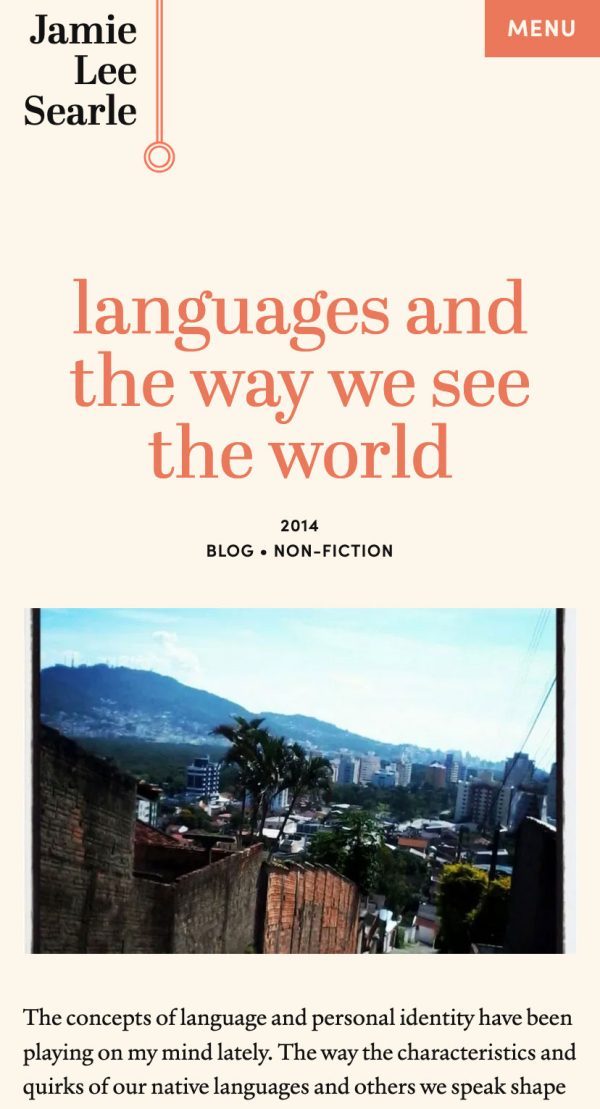
Jamie Lee Searle’s website, viewed on a smartphone screen. The background is a sandy parchment colour. In the top-left corner is the site’s title alongside a linear pendulum / lightbulb motif in pastel red, and in the top-right corner is a red 'Menu' button.

Literary leanings

Taking influence from literary staples like The Paris Review and The New Yorker, we paired Verdigris and April Display and a palette of muted 70s-tinged pastels to infuse the aesthetic with a timeless, erudite feel.

The concept for the sites landing page was to visually map the many strings to Jamies bow via an immediately engaging, yet elegant, approach. To achieve this we developed a set of subtly animated motifs for each of the main parts of the site, which can be seen as both a set of books lying flat on a tables edge, or as a series of abstract artworks hung on a gallery wall.

The mobile menu from Jamie Lee Searle’s website, which has a pastel red background, and sandy parchment coloured text. In the top-left corner is the site’s title alongside a linear pendulum / lightbulb motif and in the top-right corner is a 'Close' button.
Jamie Lee Searle’s website, viewed on a desktop screen. The background is a sandy parchment colour and a menu bar at the top right of the screen contains the words ‘About’, ‘Translation’, ‘Editing’, ‘Writing’ and ‘Mentoring’. To the menu’s left is the site’s title alongside a linear pendulum / lightbulb motif in pastel red.