Ashley Hickson-Lovence
A zingy and harmonious new home for the multi-talented author, poet and lecturer


His show
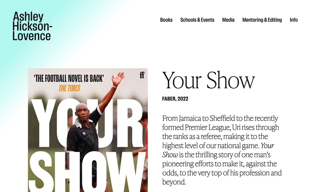
Ashley came to us in search of a website that would represent his stratospheric rise as a writer, poet, critic and lecturer, but also provide space to elevate his work with schools and universities, as well as his skills as a mentor and editor.


The whole process of working with the team at Frontwards Design was seamlessly smooth. They were thorough, professional and proactive in helping bring to life my new website to a standard that surpassed all my expectations. Their high quality service is worth every penny.
Professional pizazz
With the manifold nature of Ashley’s work in mind throughout the design process, we were aware of the need to marry his representation across both educational and literary / media contexts, and therefore our aim was to ensure the site spoke visually to both sectors, which can traditionally have quite different visual hallmarks. It was important the overarching aesthetic was both clean and dynamic, and yet posited both Ashley’s online presence and his practice as something striking, unique and engaging.
Typographically, by pairing IvyPresto Headline with Lektorat, the former added a classic, classy and literary dash to the warm, yet energetic condensed letterforms of the display version of the latter, with Lektorat’s standard version—used for much of the website’s body text—acting as a cleaner more legible companion to both of these. We created a palette that felt equally crisp, lively and fresh—albeit with a further hint of pizazz!–by offsetting a smart and utilitarian monochrome base with a vivid off-blue, and a softer, sun bleached peach.
Whilst this approach wouldn’t suit anything overtly ornamental in terms of accompanying motifs, we did want to include some subtle visual nods to Ashley’s writing—like very understated website Easter Eggs!—such as the football shirt / pitch marking-like feel of the quadruple-striped dividing line (in reference to Your Show) and the vertical linear elements with a touch of a transport / bus map to them (in reference to The 392).


