Foundation Vinyl
Clean and serene online store and brand for the stellar hardcore punk mailorder outfit


First port of call
The glossy, green-eyed calling cormorant of our logo provides an enigmatic counterpoint to the otherwise calm, utilitarian surrounds of Foundation Vinyl.
When the splendid Scott first put forward potential inspiration for the design of his nascent enterprise’s logo, it centred on the concept of the ‘calling cormorant’. Following an absorbing study of these wonderful birds, we created a sharp, graphical interpretation for Foundation Vinyl’s central logomark, composed of a striking black silhouette adorned with grainy, linear folds along its wings. The cormorant’s eye—a distinctive blue-green that had come up in a separate context with Scott—would also provide itself as the main accenting shade for both website and brand.


Typographically speaking
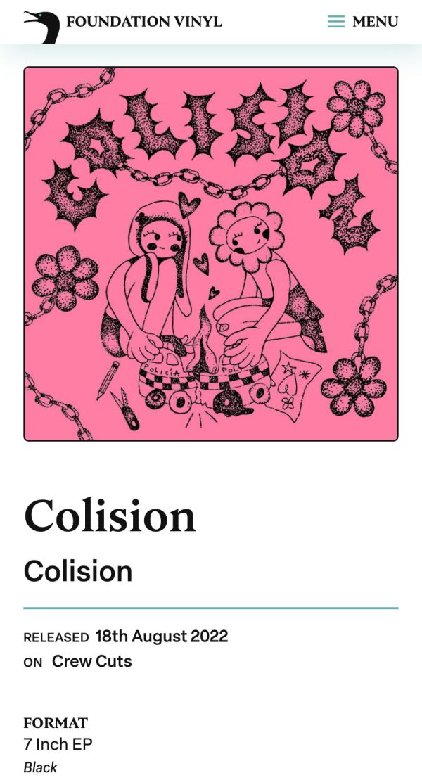
For the site’s header typography, we had already been exploring sharp-edged characterful serifs as a subtle nod to the sharp beak of the cormorant—but also hinting at a slightly expressive iteration of a punk aesthetic—and Nocturne Serif‘s angular letterforms had always stood out to us. As such, when Scott also chose this from our logo shortlist, it was one of those very nice serendipitous moments! From there, we needed to find a sans serif that balanced Nocturne’s angular expression as part of the muted and minimal aesthetic we wanted to bring to the site. The crisp Elza was a perfect option for this, especially for its versatility—remaining both clear and legible when employed for smaller contexts (captions, meta etc.) but also with enough personality to sit adjacent to the comparative expressiveness of Nocturne at larger sizes within the website’s typographic hierarchy.


Oliver and Patrick are a pleasure to work with. They engaged very carefully with our brief, both explicitly and implicitly, and their proposed solutions not only fully realised our aspirations but did so in an elegant and commercially effective manner. This reflects their strong technical skillset, which they wear lightly, and bring to bear solely with meeting each project’s specific needs in mind.