The Look & Listen page of the ‘Dark Skies Association’ website viewed on a desktop screen. The background is black with a blue gradient spanning the top left corner of the screen, upon which the site name is displayed in a condensed, small caps white serif font, with a double-line border below and a yellow star to its right. In the top-right corner is the site menu. The rest of the page is filled with a grid of rectangular, blue-outlined blocks in portrait orientation, each containing a song title in white in the very centre, and a different yellow icon in the top-left and bottom-right, in the style of playing cards.
The 'News & Updates' page of the ‘Dark Skies Association’ website, viewed on a smartphone screen. The background is black with a blue gradient spanning the top left corner of the screen, upon which the site name is displayed in a condensed, small caps white serif font, with a double-line border below and a yellow crescent moon to its right. In the top right is the word ‘Menu’ in white, overlaid on a glossy blue, pill-like shape. Below the page title is the text 'The Future's For The Brave' in an italicised serif font. Underneath is a ruby red heart icon and the text

1995

It was a real treat working with Molly to create this mysterious homage to the ‘old web’ of yore—a quasi-brutalist mixture of classical typographic drop-caps, linear border ornaments and condensed letter forms dancing cheek-to-cheek with proto-wingdings and CSS recreations of those once ubiquitous glossy pill buttons.
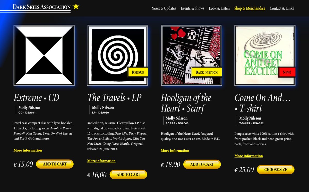
The Look & Listen page of the ‘Dark Skies Association’ website viewed on a desktop screen. The background is black with a blue gradient spanning the top left corner of the screen, upon which the site name is displayed in a condensed, small caps white serif font, with a double-line border below and a yellow star to its right. In the top-right corner is the site menu. Below is a grid displaying four product blocks: 'Extreme CD', 'The Travels LP', 'Hooligan of the Heart Scarf' and 'Come on and Get Excited T-shirt'. Each product has an image, description, a link to more information, price and a glossy gold 'add to cart' button.
The Look & Listen page of the ‘Dark Skies Association’ website viewed on a desktop screen. The background is black with a blue gradient spanning the top left corner of the screen, upon which the site name is displayed in a condensed, small caps white serif font, with a double-line border below and a yellow star to its right. In the top-right corner is the site menu. Below is a large yellow playing card-style spade icon with a blue glow, which is adjacent to the text 'Extreme • LP' in a large white condensed capitalised serif font. On the far right-hand side of this is a yellow shopping trolley icon with the word 'Cart' alongside, and the number zero above. Underneath all of this is a blue atom symbol alongside the text 'Molly Nilsson', and above a small block of text, the price 20 euros and a glossy gold 'Add to cart' button. Finally, the top half of an image can be seen, made up of black and white geometric shapes, before it is truncated by the image's crop.

Riddle me this

Dark Skies Association is the ever-so-cryptic information and shopping division of Molly Nilssons enigmatic, musical machine. As such, its 2.0 website needed to meld a practical, functional core with a huge dollop of playful, aesthetic mystery to create something that felt like some secret corner of the 90s internet—yet one that didnt feel ostensibly ironic or tacky.

Guided by Mollys exquisite mood board, and her perennial approaches to palette and typography, we created a site where each page would follow a unique approach, but—unlike many of its Geocities peers!—would also sit together under a strong visual umbrella, creating a singular, almost brand-like, identity, influenced as much by classical typographic ornaments as much as old web design traits.

We also didnt want this playful nature to be solely enjoyed by its users, so we crammed the backend with the capacity for Molly to adorn every post and page with vectorised versions of early-wingding style icons in bright red, canary yellow, royal blue or neon green.

The background is black with a blue gradient spanning the top left corner of the screen, upon which the site name is displayed in a condensed, small caps white serif font, with a double-line border below and a yellow crescent moon to its right. In the top right is the word ‘Menu’ in white, overlaid on a glossy blue, pill-like shape. Below is a photo of a long-sleeved, black t-shirt emblazoned with the words
The Look & Listen page of the ‘Dark Skies Association’ website viewed on a desktop screen. The background is black with a blue gradient spanning the top left corner of the screen, upon which the site name is displayed in a condensed, small caps white serif font, with a double-line border below and a yellow star to its right. In the top-right corner is the site menu. The rest of the page is filled with a grid of rectangular, blue-outlined blocks in portrait orientation, each containing a song title in white in the very centre, and a different yellow icon in the top-left and bottom-right, in the style of playing cards.